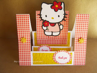
A great friend gave my kids some gifts that had included a beautiful Hello Kitty backpack. I wanted to make them a special card of thanks. I had won the Hello Kitty Greetings cartridge from ebay. I wanted to make this card as soon as it arrived. But this particular seller took FOREVER to send the cart. When it finally got here, 3 weeks later, I lost my drive to make the cuts.
Then my niece and nephew from San Francisco came to visit. The girl LOVES Hello Kitty, so she wanted me to make her one. While I was at it, I decided to make one for my card too. Now, I'm not an expert on the Cricut or anything, but is it just me or is it the cart, that these cuts are very difficult??? Took me a loooooong time to get her put together.
I used Storybook again, to cut my scalloped oval and ovals. Oh, did you see the slit punch to help hold the card closed, at the bottom of Kitty's feet?
Saturday, July 31, 2010
Thursday, July 29, 2010
Scrap Birthday
I made this card before I started blogging about my cards, so I don't remember where the inspiration came from. But I know for sure, the inspiration came from cyberspace. Anyways, this card was made from the seemingly endless pile of scraps. Most of the paper I've had for at least 5 years, can you believe it???
I hadn't done much stamping for a couple of years, and didn't realize some of my markers were drier than others. Anyways, it actually turned out okay, I think. Originally I was going to give this card to my brother for his birthday. But after looking at it for awhile, I decided it's not masculin enough, so I kept it.
Wednesday, July 28, 2010
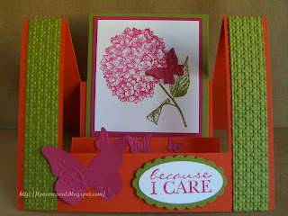
Because I Care
Got some time to surf the galleries on splitcoaststampers. With some clicking around, got linked to a website and found this! Isn't it a gorgeous and elegant card?
I was particularly excited, because I used a piece of vellum that's been laying around for 4 years! And I got to use vellum tape that was never used. Wow, what a great product! Then I got to use my new Viva Decor pearl gelpen. Yummy! The string on the bottom is a new way of embellishment for me too. The best thing was that this card was super quick to put together. Love that!
ETA: my piece of vellum is backed by a piece of light gray cardstock, thus the need for vellum tape.
Monday, July 26, 2010
Going Places
My cousin was very recently relocated to overseas. I remembered I had this travel paper in my stash. So I decided I would make her a card. I figured being so far away from home, she would appreciate a note. This card was inspired by this one found in the galleries of splitcoaststampers.com.
It was late at night, and I didn't feel like firing up the Cricut to make the cut that looks like the Top Note Die from Stampin' Up. So I improvised. I just wanted to pop out one little house to represent her new dig. I tried to highlight it by stamping the house a different color, and back it with a little circle punch. Hope the effect is noticeable. Oh, I also used the scalloped border punch.
Here's the inside.
Sunday, July 25, 2010
Thursday, July 22, 2010
Kid Birthday
Another birthday card for a child. I've been meaning to cut out the number for the child's age with my Cricut, but I just haven't gotten around to it yet. Me bad. Need to do it soon, as the child's birthday is drawing near. *NOTE TO SELF*
I also like making this card because it uses up 12 eyelets at a time. I had no idea it's this hard to use up my eyelets that I bought years and years ago... and I still have what seems like full tins of various colors of them. Then, heard that eyelets are no longer the "in" thing to use as embellishments. Good thing I'm not a trend follower or trend setter, for that matter. But I have decided I want to use up more of my eyelets.
Labels:
3D,
Birthday,
Fox and Friends
Monday, July 19, 2010
New Chicks
Got word of two new arrivals in the last couple of weeks. I had been itching to cut out this cute chick from Create A Critter cartridge, and I finally got my chance. These two cards were super easy to throw together.
There wasn't any "New Chick" sentiment from my new Punny stamps, so I had to create my own. Good thing my new stamps are clear mount so I could see where I was stamping.
Labels:
Baby,
Create a Critter,
Cricut
Sunday, July 18, 2010
Fox & Friends
I was looking for some inspiration to use my Fox and Friends stamp set. Looked on page 96 of the IBC, but didn't like the colors--too subtle. Then I found THIS in the splitcoaststamper gallery. So I started stamping the monkey in different directions. Then realized that the white CS is too small to add any more "friends." Oh well. I decided not to crowd them. Once again, my card turned out nothing like the inspiration. Sigh...
Originally, I used this Melon Mambo paper as base, embossing the front with my embossing folder. But then I didn't like seeing the back side when you opened it up. Plus, I had added brads, so you would see the backside of the brads also. So I cut up the Melon paper and used it as a card front, and adhered it to white CS. But then I thought it toned down the hot pink from Melon Mambo too much, so I added the second half of the Melon Mambo to the inside of the card, so the left side is hot pink, the right side is white. Perfect balance. Lastly, I rounded the corners on the card.
The sentiment is from My Pink Stamper. I decided to get her Punny-licious, More Punny-licious and Tweetie Hoo stamps. I do like these stamps. I just need more occasions to use them all!
Friday, July 16, 2010
Pun Fun
For today's card, I found my inspiration from Jill's Card Creations. But somehow my cards are not quite what I see from Jill's blog. Hmm.... I think in my effort to create some quick, yet different looking cards, they ended up being of the same layout. Not quite what I see from my inspiration.
In any case, I tried to do something different with each one. I used the corner rounder punch and ribbon for the coffee cup card; my new-found "ticket corner" punch for the hippo card; scalloped trim border punch for the skunk card; and scallop border punch and eyelets for the rocket card. I used glitter on each card.
Oh, the pattern paper is from the Glitter Stack from DCWV. Isn't it so cute? It's my second favorite after the brown and pink circles I had earlier.
Labels:
Pun Fun,
Punch,
Stampin' Up
Wednesday, July 14, 2010
Scrap Thank-Yous
I have recently sold some stuff online, and wanted to include a little thank-you note to each of my buyers. I was inspired by this post by Rhonda Griffin, and also a post on a message board on SplitcoastStampers.com about using scraps, so this was what I came up with.
I have so many of these little scrap pieces that I just hate to throw away. They turned out just perfect for my little 3 1/4" square notecards. A quick stamp and popped up the center piece, I was done. Quickest cards ever!
I did ink the edge of the center CS. With the mouse, I accidentally touched the ink pad, so I decided to do just a little more. I actually like this rustic kind of look.
Monday, July 12, 2010
Criss-Cross Cards
I've seen this technique a few times now. Finally decided to try my hand at it. This was the very latest version that I saw, from Barb Mullikin. I took a piece of 4x12 CS, scored at 4" and 8". The 2 side panels are further scored on a diagonal. The first card, the diagonals go in the same direction. This way, you see the card closes up onto itself.
This is the inside.
Here is another version, where the diagonals are in opposite direction from each other. Top half of the inside insert is seen from the outside.
This is how it opens up.
This is the inside.
Here is another version, where the diagonals are in opposite direction from each other. Top half of the inside insert is seen from the outside.
This is how it opens up.
Labels:
3D,
Cute Critters
Friday, July 9, 2010
New Home - Step Card
I'm so excited to show you this card. This card turned out fabulous! Took quite some time doing the cuttings, but look at the effect. This card was inspired by feline on SCS. For measurements, dimensions and a video tutorial, please check out Dawn Griffith's website.
One thing I did learn while doing this card was that, in order to pop out the roof like I did, you should stamp the house AND the roof on a piece of CS to cut out; then stamp another roof to layer on top. I originally cut out the house and the roof separately, and I just couldn't achieve the right layered look. And to line up the roof with the house when you stamp, the roof needs to look as if it's covering the top of the house, through the clear block (oh, I have the clear-mount version of this set). Does that make sense???
Oh, OMG, I can't believe I almost forgot to share something else so exciting. I've been seeing some cards made with the ticket punch offered by SU. I was kind of lusting after it, but just didn't feel like shelling out the money for it. Anyways, a thought came to me that I could use my tiny circle punch. You should turn your paper over so you can see what you're punching. If you just insert a corner into the circle punch, not all the way, just a little bit, then you can achieve the same result as the ticket punch! I love making something work more than what it's intended. Like Alton Brown says, if it ain't a multi-tasker, it has no place in my kitchen. Or in this case, my stamp room!
Labels:
3D,
Good Neighbor,
New Home,
Punch,
Stampin' Up
Wednesday, July 7, 2010
Fox & Friends
Today's card was inspired by Jason the Stampin' Dad. I used Cricut's Storybook cartridge to cut the scalloped square, and the squares. Used Fox & Friends stamp set, popping up all the heads and the mane on the lion. I decided to forgo the sentiment because I thought it might look a bit too busy on my card.
BTW, I see on a lot of SU demos' blogs that they all love using the Square lattice embossing folder. Well, I found Houndstooth by Cuttlebug, which I thought was close enough. Haha... "close enough" has always been my mantra! What do you think of the Houndstooth embossed look? Not too shabby, huh?
Tuesday, July 6, 2010
Sympathy
It is with a heavy heart that I share this card that I HAD to make. A very close family friend passed away in the last few days, lost his battle with cancer. He was entirely way too young and too good of a person to be gone so soon. He was the most humorous, kind and benevolent person I know. This Uncle has been friends with my parents since their early college days and has known me before I even existed! :) He spoke at our wedding, signed our marriage certificate as a witness. I am sure going to miss seeing him and hearing his stories. Dear Uncle, RIP.
This card was inspired first by Chiaki; then by Mary Fish. I wanted to make sure the card stayed simple, yet elegant and exuded a serene calmness. I knew I would only use black and white.
For the stamped hydrangea, I stamped it with black ink, then sponged white ink over it, to soften its look. I punched the scalloped border on both sides of the small black strip of CS on the bottom. I didn't think I had black ribbon, but I actually had black and white polkadots ribbon and the other side is black! Wow, 2 uses for 1. Not a bad pick up for $1 at Michael's. Sorry.... I digressed. The silver brad is a circle brad from SU that I just got from the clearance rack. I love it.
On the inside, the sentiment was computer generated. I actually found this stuck in one of my old catalog pages. I love this sentiment. I might have to have it made into a stamp. Oh, I actually don't have any "With Sympathy" stamps. So I just left it out. If I pick it up at the store in the next day or two, I might add it on. Just stamp over the stem of the hydrangea with it.
Lastly, the white background CS is embossed using SU's texture plate.
Labels:
Big Shot,
Punch,
Stampin' Up,
Sympathy
Friday, July 2, 2010
Joy Fold - cont.
Variation #1: Different stamp set (Cute Critters by SU 2002), decided to emboss the white CS on the small notecard. I decided to use a little velcro to keep the notecard closed.
On the inside, I did the "stamping off" thing again. This time, with a different stamp set (Definitely Decorative Daisy by SU 2000). This was a 2-step set thing, so I inked the center of the flowers with Barely Banana, flowers with Pretty in Pink. (Do you, the readers, care about this kind of detail? I guess I have quite a few of the old SU stuff.) I really like how this turned out. It really does make the paper so much more interesting, no?
Variation #2: I used the flower that I die-cutted with the Big shot as a stop for the notecard from opening.
On the inside, I had cut out the cake and popped it up with dimensional. Added Stickles.
Thursday, July 1, 2010
Joy Fold
I have seen these cards recently. Have wanted to try making something, but just never had the right inspiration. Until Mary Fish from Stampin Pretty put hers together. I loved it! I guess it was the pink and brown that sealed the deal. Here's her post. And tutorial here.
This is essentially 2 cards, one big one small. You can tinker with the dimensions to suit your needs.
I didn't want the recipient of the card to have to tie and untie the bow each time opening and closing the card. So I made it that the recipient just slides the ribbon over and the card will open.
The big pink and white papers were run through the Big Shot for dimension and interest (SU textured plate Pattern #1). The small white paper inside the small card actually has sprays of flowers (Wreath of Roses SU 2000) inked on it. I stamped first on scratch paper, then onto the cardstock. This is the "stamping off" technique? I'm not sure.
Oh, I also tried the "paper piecing" technique. Stamping lined images onto patterned paper, then cut out. I like the look. It's different.
I made 2 other variations. I'll show you those in the next post.
Subscribe to:
Posts (Atom)